“Hi, welcome to our site. You have no clue as to what we do or what to do next, but here’s a bunch of words regarding stuff you could care less about just to fill space.” Have you every been to one of these sites? Of course you have. It’s called “most of the internet”. There are many sites that like to introduce themselves to you right off the bat, tell you about themselves in a folksy conversational tone, and then lie to you by telling you that they are “the industry leader in…”, “your choice for…”, “the authority on…”, or best of all “the world famous…”. This technique is not actually a technique at all. It’s taking content for granted. It’s not understanding the value of writing, the reader’s time, and proper placement of content.
Here is an excellent example of what I’m talking about. The first sentence is a grammatical nightmare. The rest reads like it was written by someone who just wanted to write it and go on with their lives. Of course this isn’t the front page. The front page content is…is…you’ll have to read on for that…
How much written content should be on your front page? AS LITTLE AS POSSIBLE!
I know that’s odd to hear from a writer, but it’s true. Recently at an SEO (search engine optimization) convention in Chicago there were a series of lectures by people (feel free to call them freaks) who totally get off on eye tracking and consumer behavior. They pounded into the heads of each of the audience members one important fact: take the content and the pictures OFF of your front page, cuz you know what? Nobody cares.
- The picture is the first place the eye goes to. Does that make the picture more relevant or less relevant? Well, if the company wants that picture to stick in the consumer’s minds rather than their logo, which they paid a butt load for and “brands” their company, then yes, by all means, they should stay with the soulless stock photo of the man and the woman being business-like.
- The Content – The first sentence is crucial because after that the consumer is only reading bold bullet points. If you have no bullet points, you’re sunk. Just take out the content. As stated above, nobody cares.
Everything’s gone except my logo. Hmmm…what to do…what to do…
The people want direction. It’s called a “call to action” and it’s been around since the Egyptians invaded Persia. Look at your site. What do you really want your client to do? How are you going to get people to do it? Let’s take a look at two competitors offering nothing but intellectual property whom have stripped their sites down considerably to comply with new consumer research. Which one works?
 Salary.com is “the industry leader” here, but losing steam quickly. They have decided to stay with the soulless stock photos (look how diverse they are…now look closer and notice that the person of color is the employee and the white people are the employers…I’m not implying anything, I’m just pointing it out). Someone (namely the CEO) decided to pump some radio show with an interview that no one is going to listen to (lower right). And do you see a clear call to action? No. They’re going against almost everything the Chicago convention told them.
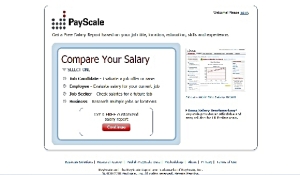
 Here’s Payscale.com. They went with a direct call to action, little color, no glitz. Their previous model had pictures and words. Since the change their click through has gone up 86%.
Internet consumers are like a pride of lions, lazy until an easy meal wanders by.
There’s a perception in society that there are lazy people and there are active people. That may be true based on the individual’s activity level, but when it comes to the internet, everyone’s lazy. Some are smart and can see where you want them to go. Others, if what you want from them doesn’t capture their eye within 10 seconds or less, you’re toast, they’re clicking away.
1) Create value immediately. Dazzling is only dallying and dallying is dropping.
2) Be glaringly clear. If you can’t say what you do in 10 words you’ve got a messaging problem. Seek professional help.
3) Love yourself from afar. Leave your CEO love fest and the “fun, family oriented atmosphere” for the about page. BTW – nobody’s clicking on your about page.
4) Flash is only good if it goes somewhere. And even then it’s sort of nerve racking.
5) If you need to explain your motto…it’s not a good motto. Go back to the first page of the Visible Reality page. Notice that they explain (badly) how they’re going to change your reality. Do you believe it? Is their site “powerful development” and “captivatingly creative”? It’s got a cool turtle…but no, it’s not.
Written by Jeremy Cairns


“If you can’t say what you do in 10 words you’ve got a messaging problem. Seek professional help.”
I agree.